|
|
||||
|
MATHS LESSON
Statistical data and charts
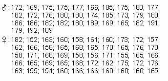
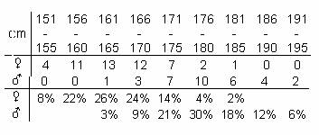
Introduction Data resulting from surveys are usually recorded in a rather inordinate fashion. For example, the following series of data contain the heights of 16-year-old students expressed in centimeters. Clearly, data in this form cannot be processed and evaluated easily. What would you do about it? We tried to count how many students reached a particular height, and produced a graph from the resulting data (Click on the graph icon.). Unfortunately, the graphs do not tell us more about the characteristics of the set then the (unorganized) numbers above.
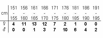
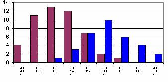
How should we make the data understandable then? 2. Grouping of the data Grouping, that is organizing the data into categories means that we split the range of our data into equal parts and count how many of our observations occur in each part (referred to as groups or categories). This value is then termed the absolute frequency. The categories together with the corresponding absolute frequencies define the frequency distribution of the sample. In the example mentioned in the Introduction groups of 5 centimeters were created, and the corresponding frequencies were determined for boys and girls separately. The image shows the resulting table.
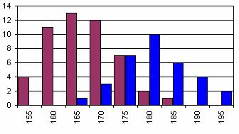
The frequency-histogram of the data.
Have we chosen the number and sizes of the groups well? What are your suggestions?
3. Number of categories The first step when creating groups is to determine the maximum and the minimum value data. The 'distance' between these two should be split into groups. Generally this is done by simply dividing the distance into equal parts (equidistant split). However, there is no general guideline on how the number of the groups should be selected. If the value is too large, the distribution becomes hardly definable, if it is too small, there might be no distribution at all. Experiment! Click on the numbers under the diagram to change the number of categories. Observe the changes in the diagram.
What
do you think are the best group-limits?
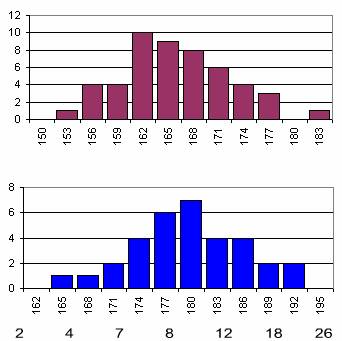
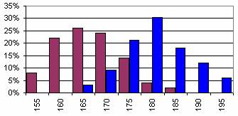
4. Relative frequencies In the diagram we have presented the distributions of heights of boys and girls together. The comparison of the data is hard since there were 50 boys, but only 33 girls participating in the experiment. How could we pass this obstacle?
The solution to the problem is that on the vertical axle not the number of elements in a category should be given, but the number of elements divided by the size of the whole sample (the number of all observations - in this case 83). This way instead of plotting the absolute frequency we say we plot the relative frequency.
The presentation of relative frequencies with the corresponding categories enables the comparison of the data. Check this by clicking on the diagrams of relative and absolute frequencies.
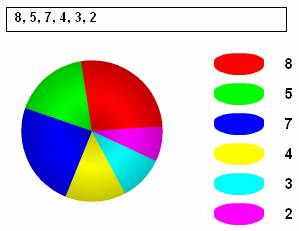
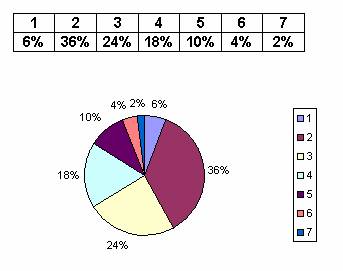
5. Pie chart A different way to visually present statistical data is using a pie chart. In a survey we asked students in a class about their favourite colours. By clicking on the OK button, you can see the pie chart from the according data.
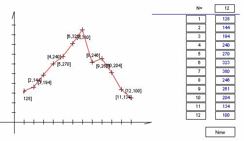
Experiment! Check the changes in the chart by adding your own data, for example with the favourite colours in your class. Note that besides pie charts we often use percentage charts, which means the proportional distribution of a rectangle. The main reason for this is that it is much easier to draw. 6. Polygon diagram If changes in the data are important, in the case of time-series for example, it is worth using polygon diagrams. The chart shows the number of sunny hours on the Dalmatian island Hvar (Croatia) in a monthly distribution
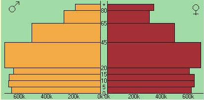
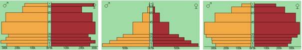
Watch out! It is not possible to determine exactly when the sunny hours occurred during a particular month, even if there is a continual line connecting the points. Try inserting different data. 7. Population Pyramid An interesting way of showing distributions is the horizontal bar chart format. For example, the age-distribution of a country’s population can be graphed easily using a population pyramid. The chart - created by the software Am globe 2002 - shows the population pyramid of Australia, male and female population is treated separately. (The age-groups are represented on the vertical axis, the size of the corresponding population is shown on the horizontal axis.)
What could be said about the population on the basis of this chart? (For example: are there more boys or girls born?, do men or women live longer?, etc.)
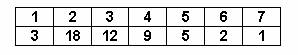
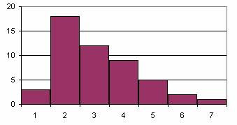
8. Summary task In a school 50 pupils were selected at random. Each of them was asked the number of children in their families. The survey resulted in the following data: 4 5 2 2 3 4 4 3 5 4 7 3 3 4 2 2 2 2 2 6 3 2 3 3 1 2 3 2 2 6 5 5 3 2 4 4 2 4 1 2 2 2 1 3 3 2 2 4 5 3. Process the data! What should be done first? You can check your results by pressing the appropriate button.
1. First step: construct the frequency table, grouping the families by the number of children.
2. Make the histogram of the distribution using this table.
3. The table containing the relative frequencies could be obtained by dividing each frequency with the size of the sample (50).
4. Using this table it is possible to draw a pie chart showing how many percents of the families have 1, 2, etc. children. 9. Excercises 1. The charts show the population pyramid of Hungary, Angola, and Sweden. The profiles of a rich country, a developing country and an Eastern European state are quite different. Try to match the countries with their population pyramids
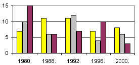
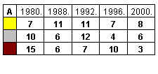
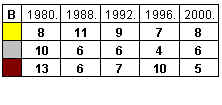
2. The chart shows the number of different medals won by Hungarian competitors in the last five Olympic Games in the 20th century, where Hungarian athletes participated. Which table corresponds to the chart?
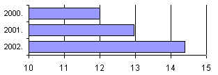
3. According to the Ruritanian government the building of rental flats was an accentuated project during the last three years. This statement was backed by the graph shown here. Why is the graph misleading?
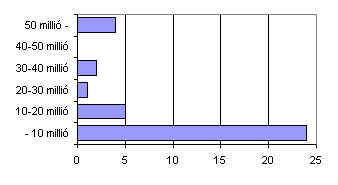
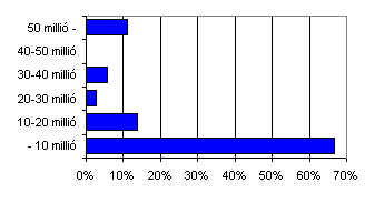
4. Find sites on the Internet from which you can collect data of the populations of European states! Make the following classes: below 10 million, between 10 and 20 million, between 20 and 30 million, between 30 and 40 million, between 40 and 50 million, above 50 million. What are the frequencies and relative frequencies of the classes? Make a chart as well. 10. Answers 1. 1.-Sweden, 2. -Angola, 3. -Hungary 2. Table: 'A.' 3. The lengths of columns are not proportional to the quantities, thus suggesting an increase greater than in reality. 4. Data of such sort can be found at:
5. The charts:
|
||||
| «powrót do strony głównej |